
I wanted to jot down some of the thoughts running through my head while working on Nani, mostly just to get my own head straight. For what it’s worth, this entire post was written by the developer without any AI assistance.
Being a tool, first and foremost

Nani Translate isn't the star of anyone's workflow or conversation. It’s a supporting character: something that helps people say what they want to say and understand what they need to know as smoothly as possible.
The goal is to give the user exactly what they need as fast as possible, then get out of the way.
To make that happen, my north star is always minimizing wait times and stripping away friction.
Prioritizing comfort over the "wow" factor
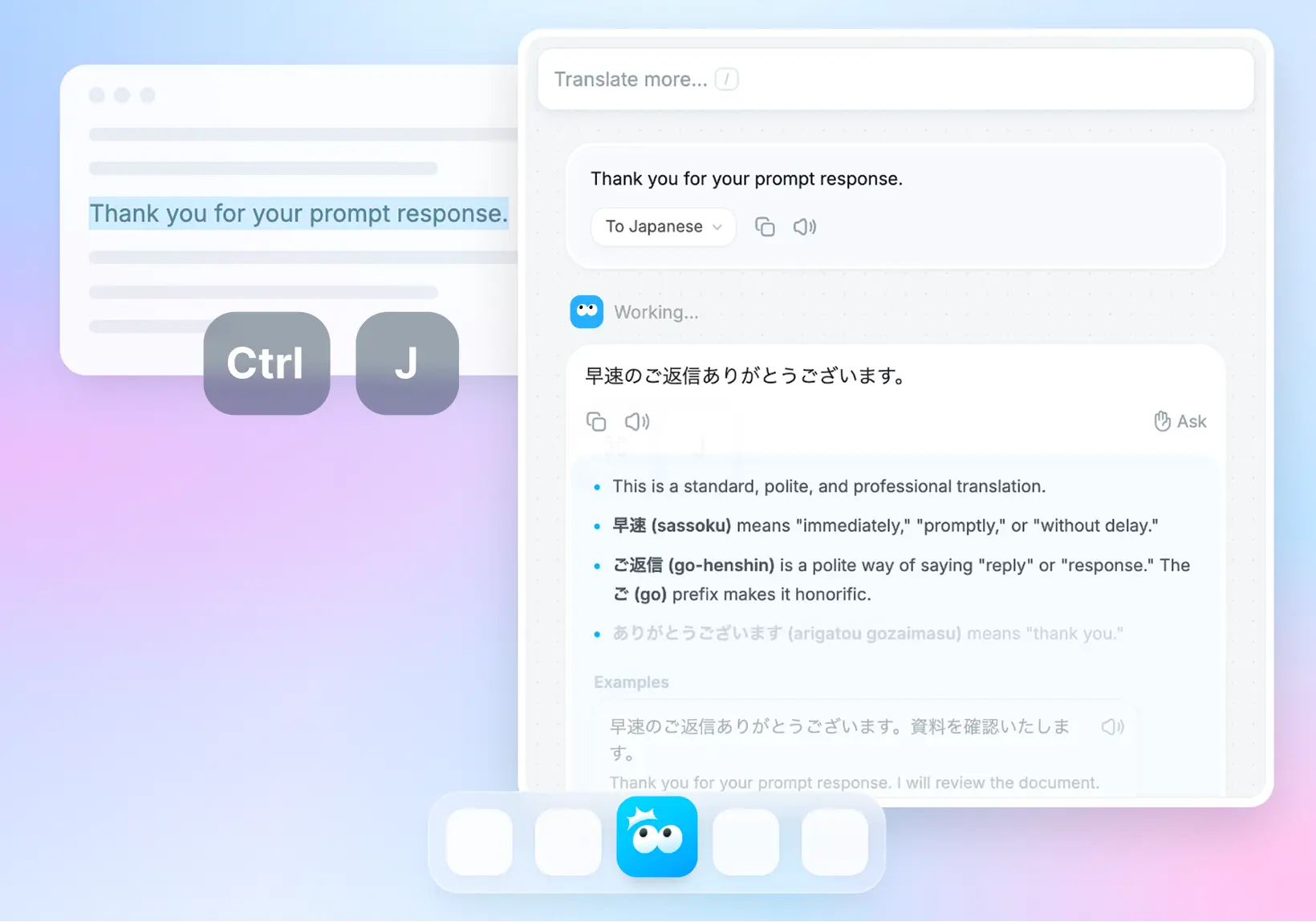
I went back and forth on this a lot during the early days, but Nani Translate deliberately leans into a chat-like UI.
I could have gone with a layout that expanded on the classic side-by-side translation view. It might have looked more like a "next-gen" tool and helped prove it’s more than just an LLM API wrapper.
But after playing with different layouts, I realized that a top-to-bottom, vertical chat UI is just the most intuitive. It makes it way easier to dig deeper, go back, undo, and just... work.
Scrolling is a win
Scrolling is basically the lowest-effort interaction on the internet today.
Tapping a button or clicking a link actually has a small psychological cost. People worry a button might trigger a full-screen ad, take them to a weird page, or lose their spot because the scroll position resets.
By comparison, scrolling is safe.
You can go back to where you were whenever you want. You can absorb info at your own pace. And let’s be honest: we’re all used to scrolling way too much anyway.
I often feel the urge to design some futuristic, complex layout, but when I focus on what’s actually usable, I usually end up back at a simple, scroll-based UI.
More features mean more cognitive load

Adding settings and features doesn't just complicate the code: it adds to the user's mental overhead. This is especially true for new or casual users.
Since AI makes it so easy to keep piling on features even in complex codebases, it’s easy for an app to get messy without the dev even noticing.
When I’m working on Nani, if a change adds even one more button to the main view, I’ll sit on it for a while. I have to be sure it’s actually worth the "clutter" it creates.
Balancing the value of a new feature against the complexity it adds is a constant challenge.
Make the defaults great for everyone
Most people never touch the settings. They might go looking for them if the app starts annoying them, but more often than not, they’ll just stop using it.
You can't assume a user will open the settings just to see what’s possible.
The app should be designed so the default state is the best experience for most people. If a setting really changes the core experience, it’s better to ask the user during onboarding.
Deciding what should be a toggle, what the defaults should be, and how to let users know an option exists is always a tricky puzzle.
Don't block the user
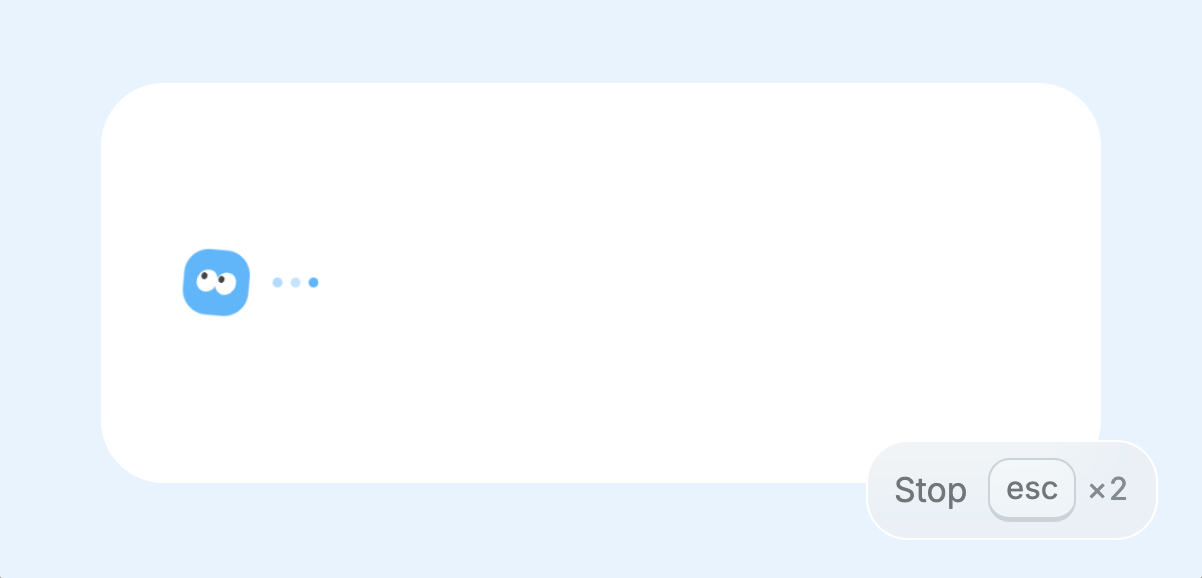
I’m a huge fan of non-blocking UX. I want to be able to do other things even while something is loading.
In Nani, I try to avoid locking the screen at all costs. You can start typing a new translation while the previous one is still generating. If you want to cancel, you can hit cancel immediately. Ideally, you should be able to use the app a bit "messily" and it should still just work.
Stop relying on instructions
It’s a hard truth: no matter how well you write your documentation or tooltips, almost nobody reads them.
Sure, there are times when long-form text is fine (like this blog post, where you’ve explicitly decided to "read" something). But when people are inside an app, they just want to get things done. Instructions aren't the goal: they're just homework.
My rule of thumb: if an explanation is more than four lines on a phone screen, it’s not getting read. Worse, it’ll just make the app look complicated.
I always try to design the UI so it speaks for itself. If text is unavoidable, I try to break it into stages or use visual hierarchy to highlight the one thing the user actually needs to know.
Niche and tailored over "jack of all trades"
In Nani, there’s a native language setting alongside the target translation language. This isn't just for the UI: it’s a huge hint for language detection, explanations, and smart suggestions.
For example, if you're set to Native: English + Translate to: Japanese:
- If you paste non-English text (like Spanish): it translates it to English.
- If you paste English: it translates it to Japanese.
In the first case, the app assumes you're trying to understand something, so it suggests things like "Summarize." In the second case, it assumes you're trying to say something, so it offers different nuances and tones for the translation.
This is technically "less versatile" than a classic side-by-side UI with a swap button. If you want to translate Korean to Spanish, for example, it takes an extra tap.
I'm actually planning updates to make this part smoother soon.
But since this is an indie project, I have the freedom to chase the experience I believe is best without compromising.
As fast as possible
With an AI tool, the main bottleneck is always the API response time. But for everything else, I develop with the mindset of shaving off every possible millisecond.
Performance tuning is one of my favorite parts of the job. Honestly, I probably spend more time on it than I should.
When I’m stuck on a bug or a feature, I’ll take a break by optimizing server-side code, reducing input latency, or making keyboard shortcuts feel snappier.
Every time I add a feature, I check if it slowed anything else down. Shaving 10ms doesn't really "change" the business, and the ROI is probably terrible, but that’s the beauty of indie dev: you can obsess over the details you actually care about.
Would I use this?
The ultimate guiding principle for Nani is a simple, subjective question: "Would I actually use this every day?"
I try to look at the app with fresh eyes (as much as possible) and ask if it actually feels good.
To be honest, there are still plenty of parts that don't feel "good" yet, which is frustrating. But I’m excited to keep nurturing this thing at my own pace, one small polish at a time.